

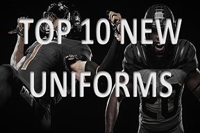
Check out college football’s best new Uni’s
There are many new looks in NCAAF; here are the top 10
Edited by Joe Reiter
Chrome helmets, shiny numbers, and and a whole lot of new looks summed up the height of the uniform revolution back in 2015.
The “uniform revolution” I am referring to is the tremendous increase in the amount of, normally not so subtle, uniforms teams started to wear a few years ago.
It all started with Oregon in ’09 as they began to wear a new uni combo each game.
Eventually, many teams started to throw in an eye-catching alternate uniform to their wardrobe, get a full makeover, or even wear new uni’s every game, like Oregon.
Though some teams may have taken a step back, the trend still continues into the 2016 season. After five weeks of football, the fans must have a pretty good taste of what this year brings.
Here are the 10 best NEW uniforms and looks of the 2016 college football season based on improvement, timelessness, and innovation.
Innovative: what sets this uniform apart? A great look has some major creativity along with a unique way to represent the team.
Timeless: is the new look simply just following some fickle trend? An iconic uniform will look fresh forever and always.
Improvement: why make something new if you are not trying to make it better? A new uniform better be worthwhile.
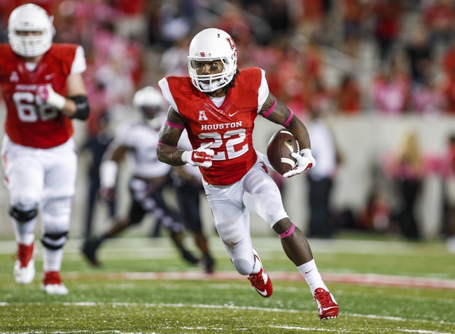
10. Houston
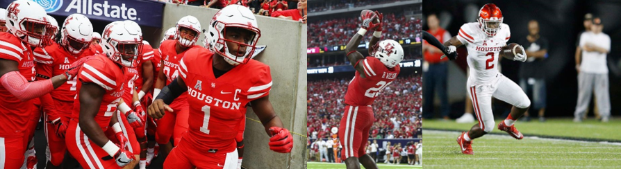
Innovation: 4 Timeless: 7 Improvement:6 Total: 17
Houston has showed that they are a legitimate contender these past two seasons, and it was time they started dressing like one.
The Cougars bounced back and forth between uniforms throughout the passed couple years. Here is what I mean with some examples from 2012, 2013, and the past two years, ‘14 and ’15.
Most teams at the top, such as Alabama, Clemson, Ohio State, Michigan, and so on are very traditional keep the same design. Now it’s Houston’s turn to join, and they went with the classic two stripe look.
Innovation: There is nothing new about Houston’s uni’s. Texas and Nebraska have been rocking the two stripes for ages. Yeah, it has been done before, but its better than some wacky design to draw attention.
Timeless: If a jersey is plain and simple, it will work. The classic stripes have been and will be worn forever. However, the color on color look, not including white, is a recent phenomenon, so I am not sure how long it will last. Therefore, I gave Houston a seven opposed to an eight.
Improvement: Although last years were fine, this is major sign that Houston will stop jumping from bad jersey to bad jersey, as seen in ’12 and ’13. They realized it’s time to stick with what works.
9. Air Force
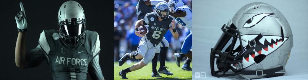
Innovation: 8 Timeless: 6 Improvement: 4 Total: 18
Air Force debuted these alternates September 10th against Georgia State. However, these may just be a one time thing.
They have worn their normal blue and white uni’s in their three other games.
Innovation: Air Force hit a home run when it comes to colors and design. The black and gray gives the uniform the feel of a jet or bomber. Also, the helmet is taken straight from the shark tooth artwork painted on planes in World War II: classic, creative, and unique. The American flag on the right shoulder and the air force insignia on the left shoulder was a nice touch to bring it all home.
Timeless: If Air Force went with some variation of stripes on the sleeves, instead of a solid color, it could become a classic. It already has the vintage shark tooth art, and its relatively straightforward.
Improvement: It is definitely a major step up from their normal, bland uniforms, but it might only be worn for once, so its hard to say that their wardrobe improved very much.
8. Oklahoma State
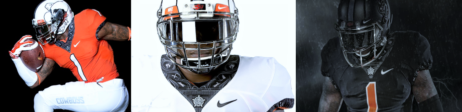
Innovation: 8 Timeless: 6 Improvement: 6 Total: 20
Oklahoma State’s uniforms may be the slickest in college football, but they are not to much different than last years.
Innovation: The trim around the collar and the arm sleeves has only been done by Oklahoma State. This trim is made up of references to iconic players, mascot Pistol Pete, and other cowboy emblems.
Timeless: The uniform is not too timeless. The trim is unique, but its hard to say that won’t just be another creative idea that that won’t look so creative in five years. Chrome helmets are big right now, but I doubt something so flashy will last the test of time.
Improvement: The uni’s are almost the exact same as last year, and they were nice too. The main difference is the new trim, so its hard to give them a lot of credit for improving.
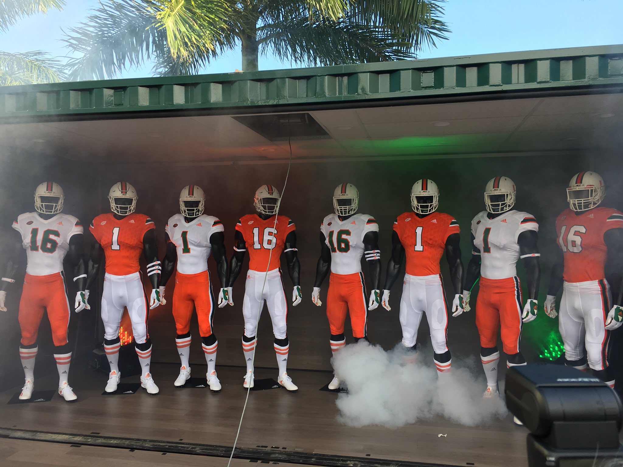
7. Miami
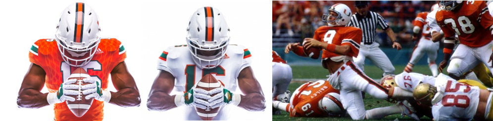
Innovation: 6 Timeless: 6 Improvement: 8 Total: 20
If you are wondering why I put Miami above OK State, its because I am looking for the best NEW uniforms, so improvement, or a better look with a purpose, will always be the tie breaker.
The Miami Hurricanes are finally going to move away from their awful, awkward, and shiny uniforms from last year.
The new uniforms are based on the their look from the 1980’s and 1990’s when they won four national titles in 1983, 1987, 1989, and 1991.
They will be debuted October 8th against Florida State, and they will become the Canes full time home and away uniforms.
Innovation: I do have to say that it was a great idea to turn back to Miami’s original days of domination, and make it modern. However, teams that come up with brand new designs normally score higher on innovation.
Timeless: The idea itself is timeless, but the jersey are a little too tight for my liking. Adidas has almost made it their trademark to make players look like they are getting squeezed.
Improvement: As mentioned before, Miami’s jersey from last year were disgusting. The large, shiny slanted blocks on the sleeves, the sliced, bright pants stripe, and the glistening numbers should never be worn again. So, these “new” historical uniforms are much more simplistic and way above last year’s atrocities.
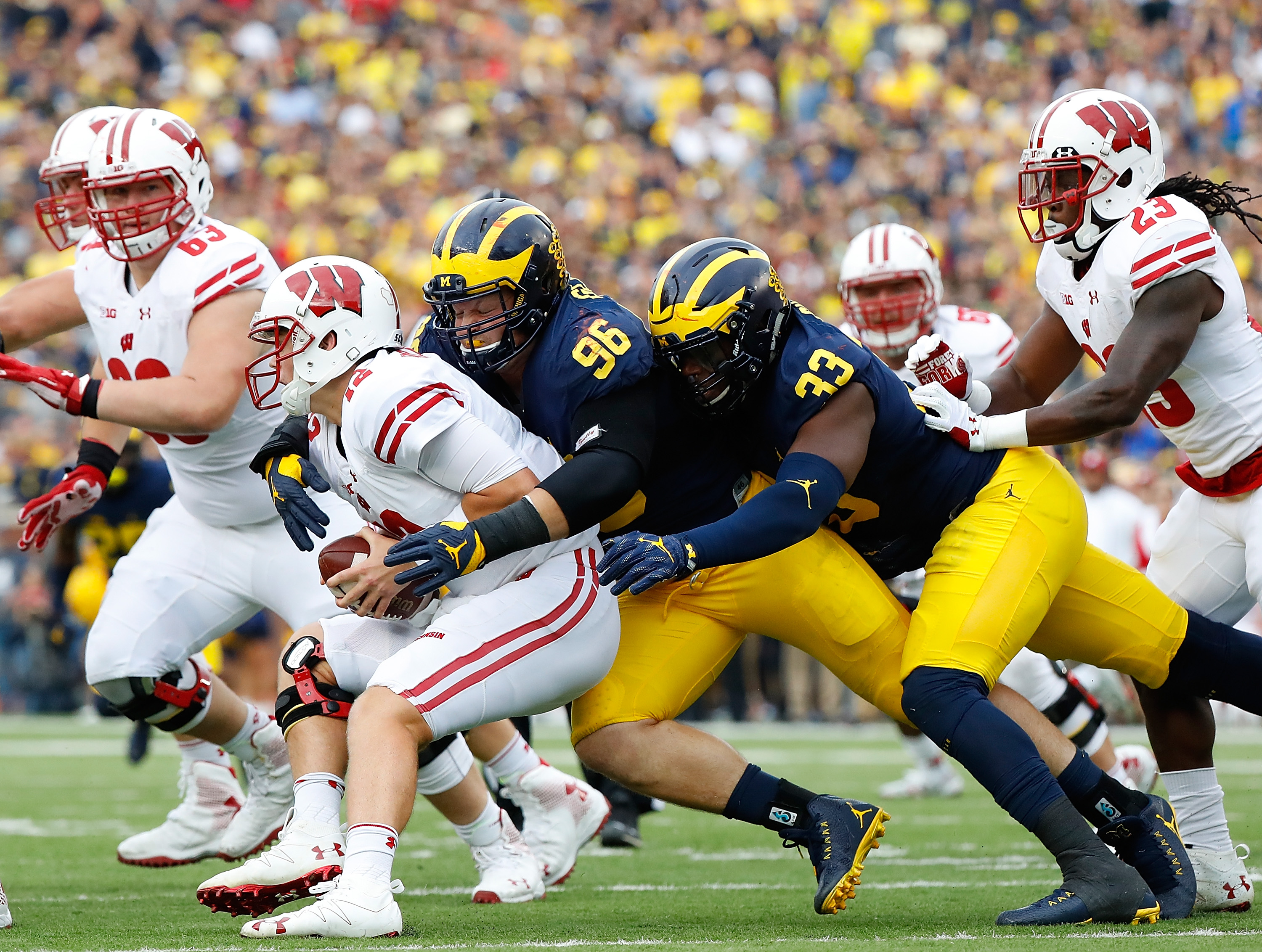
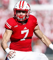
6. Wisconsin
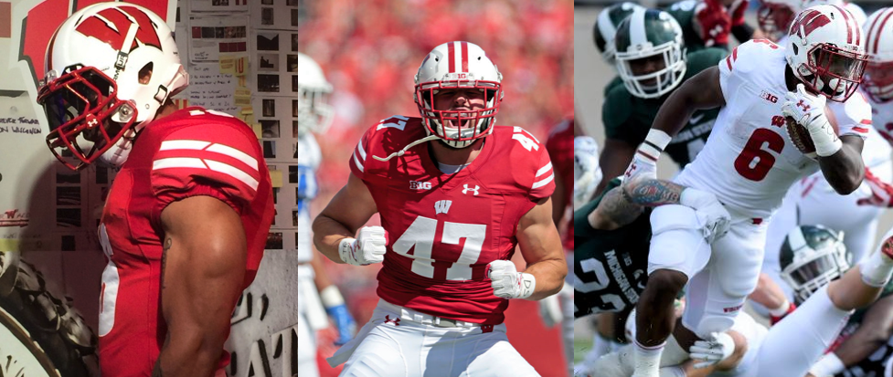
Innovation: 6 Timeless: 8 Improvement: 7 Total: 21
Wisconsin broke ties with Adidas and picked up Under Armour as its new outfitter.
These new uni’s feature negative space through the lines on the sleeve and on the pants. Also, the numbers are made in Wisconsin’s own signature font compared to previous years generic font. Lastly, the schools “W” logo is on the front of the jersey unlike last year.
Innovation: The design is basically the same as 2015’s with some slight changes. However, the new additions I just mentioned, such as the new number font and shoulder stripes, definitely gives the jersey’s a modern and more distinctive feel.
Timeless: The two stripe sleeve design has been worn by Wisconsin for decades, and it never gets old. It’s hard to see these uni’s ever going into retirement.
Improvement: Although, the the uniform is very similar to previous years, Wisconsin still scored pretty high in this category. This mainly has to do with the transition from Adidas to Under Armour. Goodbye red helmets, overly tight, and logo-less jerseys, and say hello to a classic and modern look.
5. Purdue
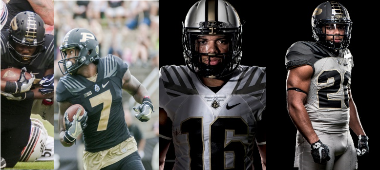
Innovation: 9 Timeless: 5 Improvement: 7 Total: 21
Since Wisconsin and Purdue tied on improvement, the next tie breaker is innovation: what makes the uniform creative and modern.
Purdue have been making some progress with their uniforms over the past few years. The new helmets, pictured above, was an especially nice touch last season.
Even after making sweet uniforms last year, the Boilermakers are still hunting for the something better.
The new uni’s for 2016 feature a new font, and an interesting top shoulder design (which I’ll get into).
Innovation: So what are all those lines? It’s the cowcatcher on the front of a locomotive. Incorporating a teams mascot, or theme, is always appreciated, and when it’s done this well it becomes one of the best uni’s in college football.
Timeless: The score dropped in this category. What makes these unis’ innovative is the shoulder design, but it does not make them timeless. That part of the uni may be cool now, but it may seem outdated in 5 years. Remember Oregon’s awesome shoulder design from ’08? Yeah, not so awesome anymore.
Improvement: Although the uni’s from last year were slick, this years were on a whole new level thanks to the unique addition I keep praising. It’s not flashy, and the attention to detail is there.
4. Oregon
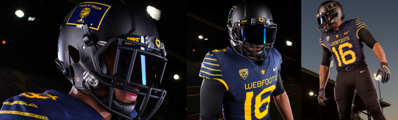
Innovation: 10 Timeless: 7 Improvement: 5 Total: 22
The Ducks will be wearing these old school inspired uniforms October 8th against the Washington Huskies.
The Uni contains the school’s fight song on the sleeve. The colors and nickname, “Webfoots,” were used in 1916. Also, the matte black helmets support the Oregon state flag.
Innovation: This is the most innovated design of this year. These are not replicas, but instead they are influenced by the 100 year old uniforms. It must have taken some real thought to come up with this; digging back through the decades, putting the fight song on the stripes on the sleeves, the Oregon flag, and no unnecessary bling. Oregon hit a home run with these bad boys.
Timeless: They are inspired by a very old design, and its straightforward after that. Maybe these won’t be as cool way down the road, but they will be cool for awhile.
Improvement: Oregon scored a little bit lower in this area since the jerseys are not much of an improvement from anything. Instead, they are going to be a one-and-done alternate. Therefore, its hard to say their wardrobe really improved a whole lot.
3. Michigan
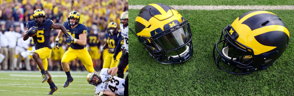
Innovation: 6 Timeless: 10 Improvement: 6 Total: 22
The biggest change for the Wolverines is the switch from Adidas to Jordan (Nike). Also, the matte blue helmets are an awesome twist.
As of now, Michigan has yet to release an alternate uniforms, and athletic director said that they won’t have any this year. Moving forward, it will be head coach Jim Harbaugh’ s decision.
Harbaugh said he would “keep an open mind,” and that he would be dumb to deny Nike’s design expertise when coming up with a new alternate look.
Innovation: The helmets with the matte or no shine paint are pristine.
Timeless: Well, Michigan has been wearing the winged football helmet since 1938, and have arguably the most iconic look in college football. Michigan’s simple blue or white uniforms have never looked bad and probably never will.
Improvement: These new uniforms keep the same design as the previous, but the main improvement is the switch from Adidas to Nike. Adidas has a history of making uniforms that are far from aesthetically pleasing, and its good to know that those have been put to rest.
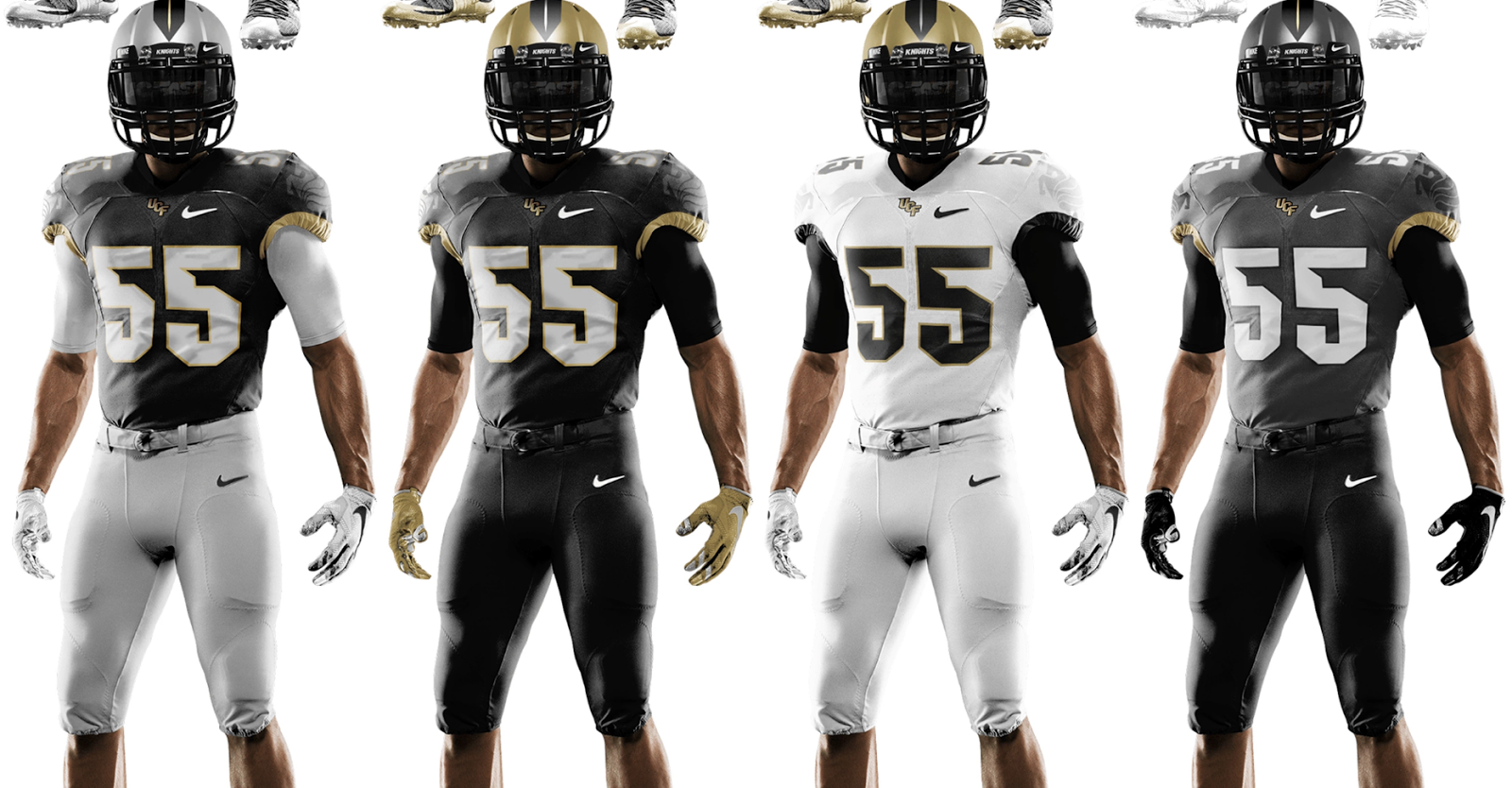
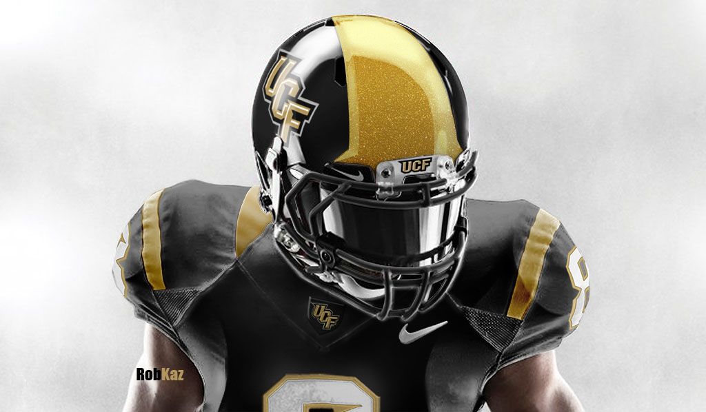
2. UCF
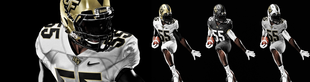
Innovation: 8 Timeless: 6 Improvement: 8 Total: 22
Well, UCF uni’s are much improved.
Head Coach, Soctt Frost, loves the new unis, but he does not see them lasting more than two years:
“I want to keep moving the ball down the field with our uniforms and I think we will come up with some new things down the road,” said Frost
Innovation: The sword stripe on the helmets is an interesting way of showing of their knight mascot. A black matte is always a hit. The endless possibilities of uni combos is also a clever way keep things interesting. Also, the Pegasus on the sleeve, which is the school’s academic logo, is an subtle yet creative idea.
Timeless: As cool as the Pegasus design is, this type of artwork rarely outlast father time. Other than that, the uniforms pretty basic, so they can probably last a while.
Improvement: UCF had some of the ugliest uniforms in football the past few years. The oddly placed shoulder stripe, the tan jerseys, and weird helmets are gone. They did not just improve, but they now have one of the best uni’s in football.
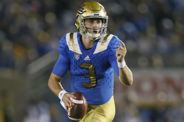
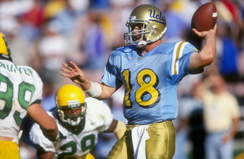
1. UCLA
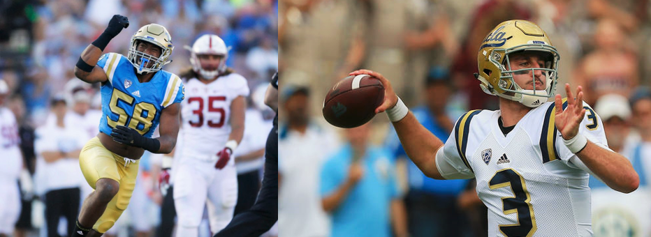
Innovation: 6 Timeless: 9 Improvement: 8 Total: 23
UCLA has the best new uniform of 2016.
After trying something a little bit more modern in 2014, the Bruins really fell over the edge in 2015, and it was not pretty. Due to fan complaints, UCLA has made a change.
The new uniforms they are wearing now are just a modern rendition of the same classic look they had always had until the past two years.
The Bruins will also be rocking a navy blue uniform sometime this season, and if it’s anything like their 2012 Rose Bowl uni’s were in luck.
Innovation: This uniform probably did not take too much creativity to make, but the classic design is always a plus, so its good to see that UCLA made the change. I have to give Adidas credit for finding a look that would always work which leads us into…
Timeless: The big stripes over the shoulder is a vintage look, and the classics never die, so this one is just about as timeless as it gets.
Improvement: I would say the 2015 uniforms were ugly, but that would not do them justice. Teams that have a great tradition, like UCLA, tend to be very conservative when it comes to their wardrobe. Yet, the Bruins uni’s last year had sparkling, slashed numbers and shoulder stripes. The uniforms themselves were tight as possible with an odd diamond pattern. Its good to see that the UCLA Bruins are done desecrating their image and are turning back to whats best.
So that’s it, the best new looks of 2016. How do you think I did? Anything I missed? Leave comments below.

I am a senior, and a first year Quill writer here to bring the news to you one swift stroke of the pen at a time. I run cross country and track with the...


