

The new Elder brand
Elder replaces the old emblems and logos with a coordinated marketing strategy.
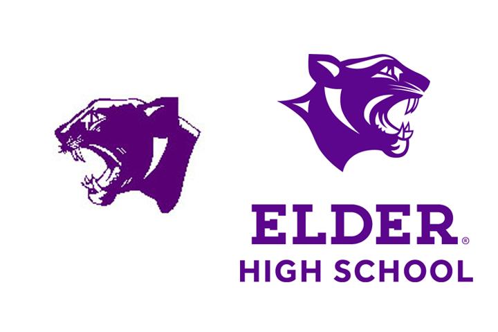
Comparison between the old and new design for the panther head.
For nearly eight months a completely new design concerning the trademark logos of Elder High School has been in the making. Elder employed a local marketing studio last year in the spring to piece together the main ideas about what peoples’ perceptions of Elder were.
According to Mr. Rogers, Elder faculty member and practicing graphic designer, the main purpose of these early meetings was to interview current and prospective families about their perceptions of Elder along with our competing schools such as La Salle, St. Xavier and Oak Hills.
Therefore the Elder administration and board teamed up with design agency, Madison Design, and they delved into the specifics of the marketing that would benefit the project the most. The first step was to develop a brand strategy that would guide everything in the design process. The final looks like this:
ELDER’S BRAND POSITION STATEMENT:
Elder is more than a community. It’s a home. A deeply involved family experience that is always welcoming and accepting, always encouraging, always loyal. With rigorous academics and a spirited campus life, we challenge students to develop the character, critical-thinking skills and values to be a positive force in the world. The Elder family stands behind each other and stands up for each other, every step of the way. So students can succeed in life – and as men.
From this point, the team started to look at the logo itself.
I could illustrate at least one hundred elements that went into
inventing the new identity of Elder, however, only the most important aspects of the new design will be covered. If I went any further this article would practically turn into the template of the logos themselves, and that template is fifty-five pages long… That is just a peek at how much work went into creating the recent branding.
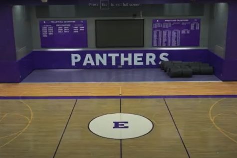
To start out with, every Elder emblem and logo has been replaced. From the iconic “E” to the Alumni logo, all aspects of the Elder emblems have changed. Most changes are minor, but one can definitely notice the difference when seen for the first time.
One idea instituted in the the new logos is a “blank space” around each Elder emblem. This means there cannot be any text surrounding the design from a certain distance. This is not only appealing to the consumer, but it fits in perfectly with Elder’s main morals such as loyalty and respect.
Now, the panther head has the most excitement surrounding it pertaining to its changes. The panther head is arguably the most iconic image of Elder, so its not a surprise so many people are concerned with its changes.
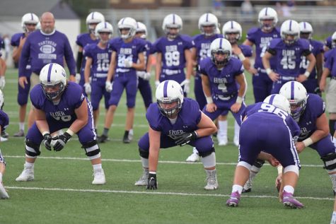
Another significant change is the new branding rules on the sports uniforms.
When the changes are officially instituted, the sports jerseys will no longer have the word “Panther” or any other name pertaining to Elder except for simply “Elder.” This would directly affect the baseball teams uniform considering it has the word “Panthers” labeled across the top of the jerseys.
Mr. Rogers states, “We all know the color purple. We all know the sports teams here, and some of the findings they (the design team) found was that the name Elder is really really important, so in everything we do we want to have ‘Elder’ in the forefront.”
One out of the plethora of students concerned about the logo changes, Vince Sabato, claims, “The old panther head was due for a change. I am glad Elder is finally spicing things up a bit with some modern looks.” Casey Martin had a similar mindset, as he stated, “I was worried when Mr. Grimm mentioned all new looks for Elder, but I am relieved now I like the changes.”
A current baseball player, Ben Farwick expressed, “To be honest I don’t think it is a big deal, we will play the same either way.”
Although the majority of the students were pleased with the new emblems, there were a few distasteful reviews. Eddie Cliffe mentioned,”I don’t know they just rub off on me wrong. The old one is what I’m used to, and I say don’t fix it if it ain’t broken .”
Despite all of the opinions about the new designs (the good and the bad), the main purpose of the new Elder branding is to institute a system in which we are all united through the same design. The face of every sports team and club will be connected through its layout.
This message stands tall with the crucial element that makes Elder so unique: brotherhood. In making the principals the same for every logo that pertains to Elder, brotherhood rings out louder than ever.