Logos carry subliminal messages
Common logos mean more than we think
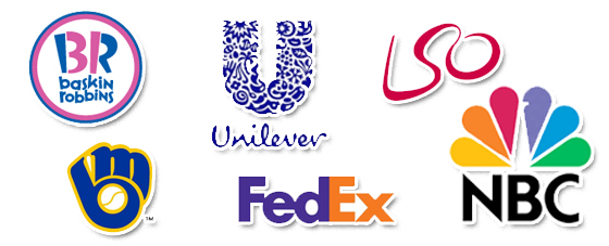
Behind every logo used by a company, a discreet, yet important message lies between the lines. Thus, the cleverness of these graphic designers all deserve a certain type of praise for their wit.
The Amazon logo has a commonly renowned smile draw underneath the word, “Amazon.” However, this smile truly serves as an arrow from the A to the Z in the word to symbolize the fact that Amazon has everything from A to Z to make us satisfied. 
“I just don’t think I can ever see that logo as a smiley face now. All I’m going to notice is an arrow pointing from the A to the Z”, commented Senior Tony Timmers.
“I’m afraid to see what else I’ve been missing the whole time because it’s just going to ruin the vision I’ve had for every logo.”
As made famous by Elder faculty member Mr. Spencer, The FedEx logo contains an arrow between the E and the F, symbolizing the speed of the delivery service.
“It’s just annoying to see the FedEx logo now. I can’t take my eyes off the arrow. I guess it’s a good addition to the logo and all, but I just want to see the old FedEx logo again”, Riley Burke added.
Mr. Spencer was correct w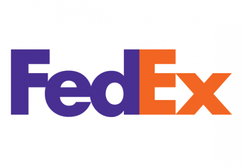 hen he displayed to us this knowledge, we will never see the FedEx logo the same way.
I recall vividly when he stated, “Every time you see this logo you’ll just see the arrow, for the rest of your life, just arrow.”
Alongside the FedEx and Amazon logos, the NBC logo also carries meaning. Sure, most people may know that it’s a peacock, but nobody may directly understand why. As color TV units were being sold for the first time, NBC used the idea of color as a sales tactic. They wanted to incorporate color into their logo somehow to show the black and white TV owners what exactly they were missing out on.
Through examining the options of objects that represent color, including rainbows and butterflies, they decided on the peacock to display the colors proudly.
Not only did NBC want to showcase these colors to coax the audience into buying color TV units, they also wanted these colors to represent something. Each of the six colors has a specific meaning. The colors represent, news, sports, entertainment, stations, networks, and productions.
Also, it is no coincidence that the peacock’s head is turned to the right. This symbolizes the fact that the company is always looking forward to the future of broadcasting and entertainment.
As long as graphic designers continue to use their wit to develop logos, there will be more subliminal messages to be interpreted by a large audience.


