Elder students compete in Vans Custom Culture contest
Voting begins April 26th
April 18, 2017
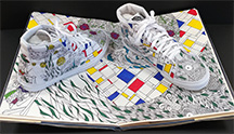
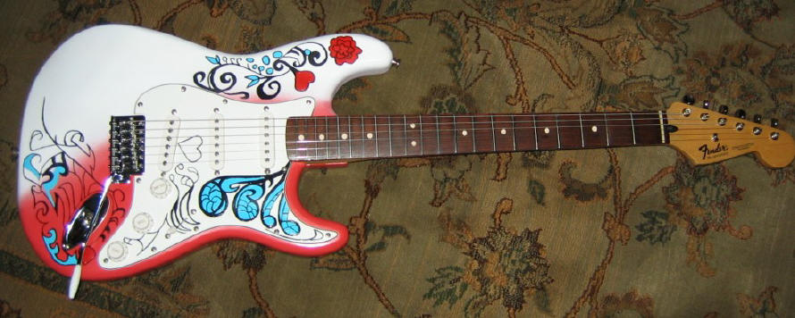
Elder competes in Vans Custom Culture contest (photo taken by Mr. Buetsche)
Elder’s industrial design students are competing in a competition that could win $50,000 dollars for the Art program.
The people over at Vans have given Elder and thousands of other high schools the chance to express their creativity by designing four shoes and one poster. The four shoes were created for four different categories: art, music, local flavor, and action sports, and the poster is supposed to “exemplify technology in design” according to the Vans Custom Culture page.
So how does the competition work?
Basically, we registered to be in the contest, Vans sent us four different plain white shoes, and then we went to work. All shoe designs have to be sent in by April 10th, and the voting begins April 26th.
So how did we get involved?
Industrial design teacher Mr. Buetsche said,”Actually, the art teachers at Mercy informed Mrs. Plagge about the contest since they had done it for the past couple years, and she signed us up. After reading through the guidelines, she felt it was more geared to the industrial design class.”
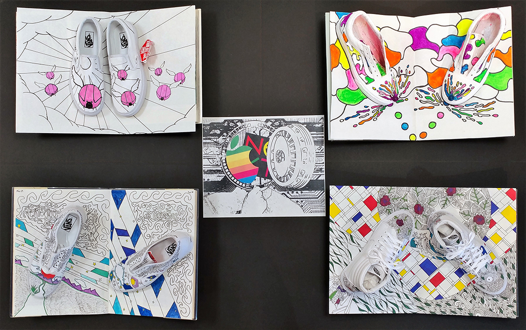
Each design has a common theme which is to have a primarily white shoe with black lines to represent a partially colored coloring book. The shoe is then supposed to pop out from the page.
After weeks of brainstorming and designing the Industrial design class came up with this.
Art category
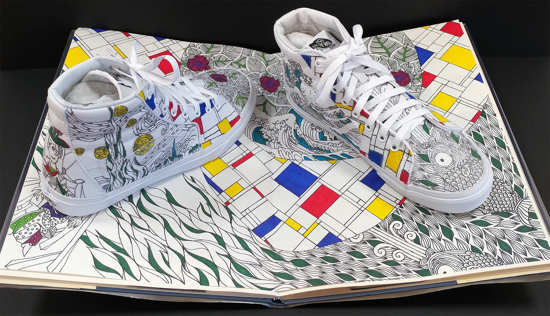
Group members: Michael Rosen, Ryan Schenkel, and Connor Craig
The goal of this group was to create a design that emulated classic pieces of art work throughout history.
Out of each of the designs, this one is without a doubt the most intricate, and it really brought the history of art together quite nicely.
Michael Rosen, the artist, told me the groups had “initial ideas like a graffiti styled shoe and even turning the shoes into famous pieces of architecture. But, since all four of the shoes had to fit in a cohesive theme, we ran with Mr. Buetsche’s idea of the shoes mimicking a coloring book.” Ultimately, they decided to go use famous art pieces.
As for the artwork itself, Rosen filled me in on each piece: “On the left shoe, we drew the Wave of Kanagawa on the side, the Scream on the back, and a really cool fish print that I found online on the front. On the right shoe, we drew Starry Night on the side, Dora Maar au Chat (a Picasso piece) on the back, and a beautiful rose print on the front. We tried selecting pieces of art that were somewhat easy to draw onto a shoe.”
The shoe is quite detailed, and it was difficult for the group to recreate certain paintings with sharpie. Still, the design turned out looking great, and all the pieces came together with Rosen feeling that “it was a whole lot of work, but I feel very good about what my group and I accomplished.”
Music category
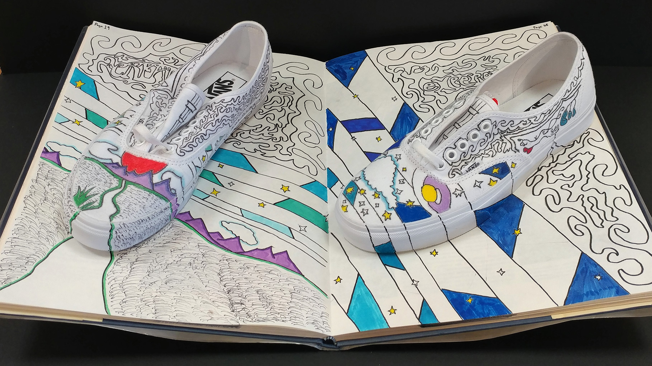
Group members: Connor Bareswilt, Joe Reiter, Jake Wells, and David Datillo
For our design, we recreated 1960’s psychedelia in music, and more specifically the year 1968 with trippy bands such as Cream and The Jimi Henderix Experience releasing their best song in that year; the bands names are woven into the patterns on the coloring book part of the design with the pages being labeled page 19 and page 68.
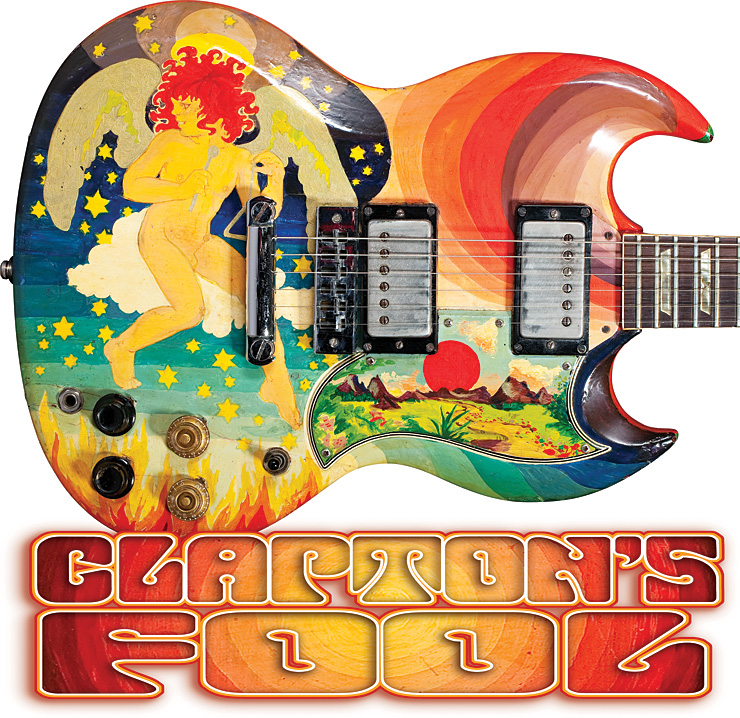
The bottom of each shoe is reminiscent of Eric Clatpon’s Gibson SG “The Fool” guitar that he played during his days with Cream.
On the way up the shoe, the line art is taken from one of Jimi Hendrix iconic jackets: he wore a military jacket with a similar design on the elbows.
The sides of the shoe features a floral decal much like the one seen on the guitar Hendrix famously set a flame at the Monterey Pop Festival. The floral design is circled by two consecutive lines that look like the outline of the head stock of a Gibson SG guitar while the tongue of the shoe contains a design similar to the neck of a Gibson SG.
Local flavor category
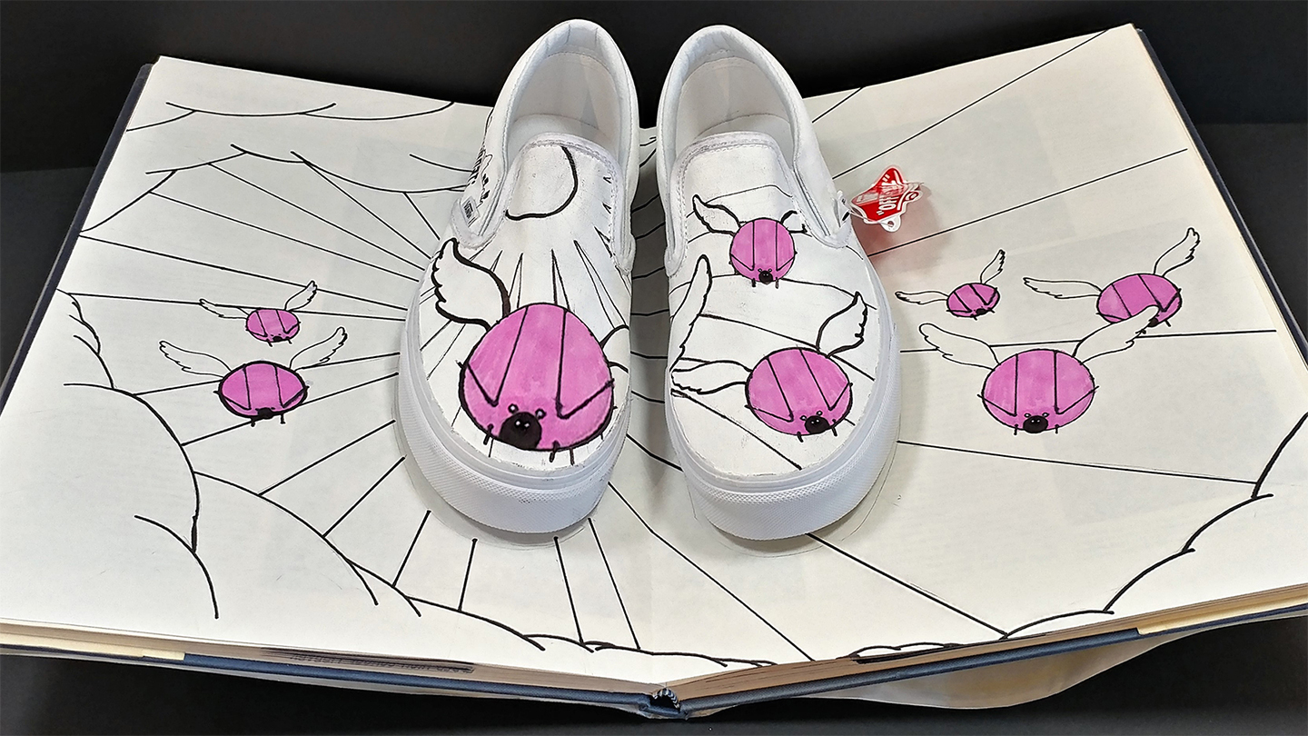
Group members: Will Colvin, Riley Burke, Michael Onorato, Pat Leesman
At a glance, it looks like this category is all about food, but it is really about anything that represents the community.
Originally, the group took the idea of local flavor literally: “We looked at skyline, taking it laterally. Then we looked at what is unique about Cincinnati, and we were inspired by the Big Pig Gig which are all the statues of the flying pigs down town,” said Pat Leesman.
The statues are giant fiber glass pigs were inspired by the annual Flying Pig Marathon and the fact that Cincinnati’s nickname is “Porkopolis.”
As seen, pigs are flying down from the sky with clouds bordering the coloring book pages.
Action sports category
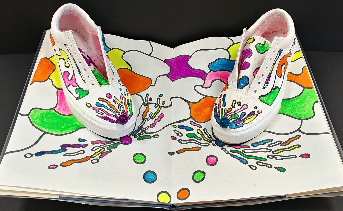
Group members: Jake Ramstetter, Sam Otten, Jack Mazza, and Austin Smith
Ramstetter told me that they wanted to do a shoe that resembled a “skateboard, but the idea was already previously used in earlier competition, so we decided to go with the paintball.”
Otten mentioned that the project “started off rough because our partner decided to shoot it with a paintball gun, and we had to re-paint it white. We bounced back after the disaster.”
So, this group had some painting malfunctions to begin, but they turned it around and came up with something really unique.
One of the final touches to the design was the paint ball on the tip of the shoe that appears to be splattering upon impact.
The action sports group in particular helped determine the overall theme for the whole class because they wanted to do florescent colors on a white background. This idea led to the partially colored coloring book concept that Mr. Buetsche came up with.
Technology category

Group members: Mark Klusman and Austin Gilkey
Originally, these two guys wanted to make a poster about “computers controlling people.”
“But then, I scrapped the whole idea with three days left to go because it stunk. I made that (the final poster) in one night, and it turned out to be really cool,” Gilkey mentioned.
The center of the design features an iconic image of Steve Jobs with his head replaced by a vault which opens to reveal two of his great ideas: NeXT Computers and Apple.
The backdrop is littered with circuits which is very symbolic of modern technology, and then faint binary numbers, which are the core of digital technology, are plastered in the background
For a final image, one more picture was taken of all the designs together.
Mr. Buetsche feels the designs turned out well: “I am happy with the final products being that it was our first year participating in the contest. For the limited time we had to really work on them in class, it was a nice effort. I think the combination of design and art student was beneficial in a group.”
Voting goes up on the April 26th at http://customculture.vans.com/, so be sure to get out there to vote for your fellow panthers!