

Oversimplified logos: the good, the bad, and the dumb
Are these flat logos really as bad as people say?
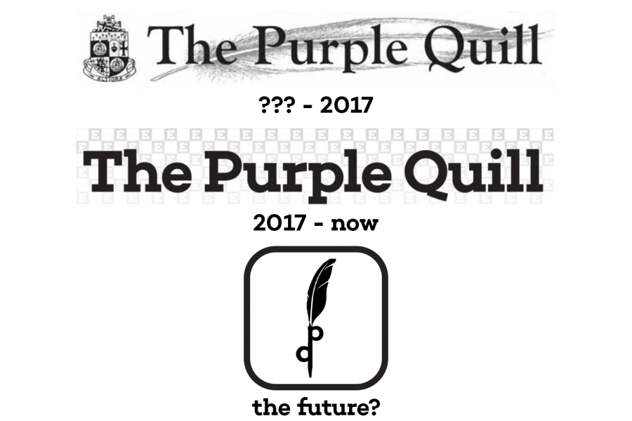
Could the Purple Quill see its logo succumb to the trend of oversimplification in the near future?
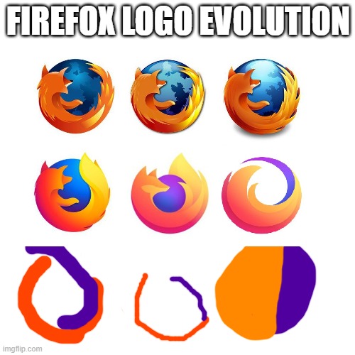
When Firefox unveiled a new logo a couple weeks ago, many users were enraged. The new logo, which removed the fox, was an example of oversimplification going too far, some argued.
Companies like Firefox, they say, are scrapping their perfectly good logos and simplifying them just to appear trendy.
Oversimplification, however, is not the cancer that people online claim. In fact, there are plenty of examples of oversimplification gone right. Conversely, there are just as many examples of oversimplification gone wrong.
As The Quill’s resident graphics expert, I will take a look back at some simple logos and give my professional opinion.
The good

Many of the most iconic logos of all time are extremely simple. For example, the McDonald’s golden arches is instantly recognizable and widely considered a great logo, despite just being a yellow “M”.
It’s also a huge improvement over McDonald’s logo from the 1950’s.
Another great example of a simple logo would be the Apple logo. Introduced in 1977, the logo is a no brainer: it’s an apple with a bite taken out of it. Like the McDonald’s logo, it is a no-nonsense and straight-to-the-point logo.
Apple has a good history of simple iconography. IOS 7 flattened the icons for all of the pre-packaged apps, which in my opinion was a huge improvement.
The bad
Not all companies can afford the graphic designers who work for Apple, and it shows.
In 2018, a great tragedy occurred. Animal Planet killed its old logo. They changed the iconic green logo with the sideways “M” to a generic piece of garbage with the world’s stupidest looking elephant.
The elephant was apparently trying to recapture the magic of their logo from 1996-2008. They just seem to have forgotten that the old logo was good.
– Some Taco Bell exec, probably (Taco Bell)
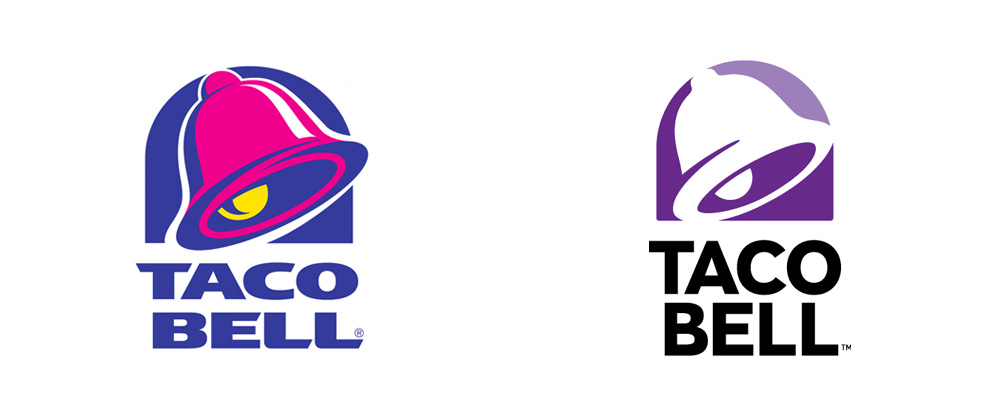
Yet another tragedy occurred in 2016 when Taco Bell made the awful decision to “modernize” their logo. From 1994-2016, the Taco Bell logo with all of its vibrant colors was a beacon of hope for all searching for a meal in the wee hours of the night.
The new logo, however, decided to remove all of the flavor from the previous logo, opting for a white and purple look. Yes, you read that correctly, they kept the shape of the logo basically the same, but removed all of the amazing color. What a shame.
The dumb
From 1992-2004, Cartoon Network’s logo was just the words “Cartoon Network” in a checkerboard. From 2004-2010, the logo changed to just CN, but at a fun little angle.
In 2010, the logo changed once again, flattening the CN and effectively murdering any sort of personality the logo had before, which probably is not a good idea for a channel meant for kids.
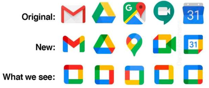
2020 was a year that will go down in history as one of the worst ever. Among other things, Google updated the logos of many of their apps, including Gmail and Google Docs.
The did not just stop at flattening their logos. Instead, they decided to make every single logo look the exact same, a move that went over about as well as the recent Firefox scandal.
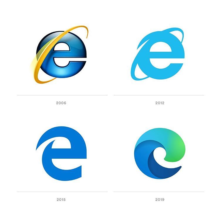
In 2006, everybody’s grandparents’ favorite web browser Internet Explorer introduced its iconic logo, the blue “e” with the golden diagonal halo. Microsoft flattened the logo as well as anybody’s desire to use the browser in 2012.
However, this was not enough for Bill Gates and co. In 2015, Microsoft did not replace the logo; instead, they replaced Internet Explorer with Microsoft Edge. Not only did they downgrade the browser, but they also downgraded the logo to just a blue “e”.
Just when we thought the logo could not get any worse, Edge received a new logo in 2019, replacing the generic “e” with an even more generic wave-looking thing.
Finally, the fine folks at Kellogg’s decided to put the Pringles mascot through a midlife crisis. Since, the dawn of time, Mr. P, the Pringles mascot, has sported a full head of hair as well as his iconic mustache.
Unfortunately for him, when the Pringles logo was redesigned in 2020, Mr. P lost his luscious locks (as well as the outline on his face). He also lost the shine in his eyes. Does this mean that the graphic designers locked up Mr. P in a dungeon with no light and forcibly shaved his head? Or is this yet another example of graphic designers thinking that logos with no personality are hip? The world may never know.
All in all, I do not believe that there is anything wrong with the concept of a simple, flat logo. However, when these logos replace otherwise good logos and/or are just bad (cough Taco Bell cough), they are unacceptable.
In a world where seemingly everything around us exists only to sell us stuff, maybe it is better to have a logo with personality then a “trendy” logo that will be outdated in five years.


Anonymous • Jun 6, 2021 at 4:01 pm
I’m happy I grew up with the old Pringles logo. The new one makes him completely lose his whole look. Also, I’m actually fine with the new Cartoon Network logo, but the new animal planet logo was very very very dumb.
Daniel • Apr 22, 2021 at 11:04 am
I in all honesty don’t mind the new Windows logo, but what I miss about the old logo is the vibrant colors.