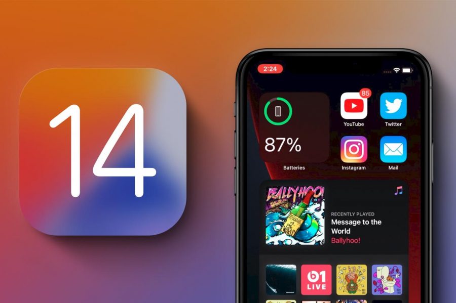
iOS 14 is for the masses
https://www.macrumors.com/how-to/install-ios-14-ipados-14-betas/
iOS 14 is soon to be here adding tons of features for the Apple user
I can remember all the way back in grade school when iOS 7 was ready to be released by Apple. One of my brother’s nerdy friends was really into technology interfaces and I never really understood why. Until I saw iOS 7. It was the first time I saw Apple make an absolute leap just with simple design. I remember listening to Jony Ive explain how they merged utility with design seamlessly, and boy did they do it well.
It was the first time also that smartphones had a three-dimensional parallax, meaning there seems to be a space between the apps and the background, utilizing the accelerometer to keep the perspective proportional with the movements. That was seven years ago. Apple has come a long way in seven years.
Between September 15 and 18, the newest user interface for Apple devices will be released. Like its predecessors, it will be called iOS; in the 14th iteration. Since 2013, this will be the biggest revamp that Apple has done for its interface. Characterized by its customizability and highly simplifying qualities, iOS 14 is going to change the way we look at smartphones, tablets, and computers for years to come.
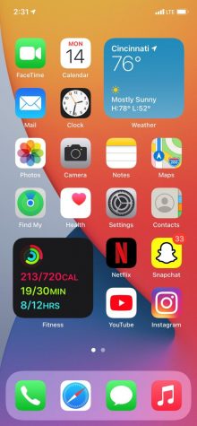
The first feature that needs the limelight is the installation of widgets. What are widgets? Simply put, it is a way an app can exist on your home screen but also convey its most potent information at the same time. The widgets are intui
tive, interactive, and functional.
For example, now the weather app can exist on your home screen, but also it can show you the weather right now and for the next couple hours. Your calendar can scroll through your next appointments as you look down to see how far your activity rings are coming along. The widgets are beautifully designed and even easier to use and take advantage of. The customization is limitless, literally. The widgets can be placed anywhere on the screen.
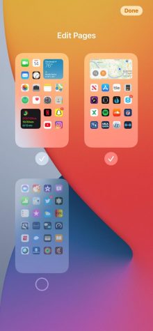
Another great feature that lives within the boundaries of home screen is the arrival of an App Library; which can now feature home pages. Most of us download apps for one time uses or really only access some apps a couple times a year at most.
These apps get piled up and make home screens cluttered and dysfunctional. Apple took care of this by implementing two new features. One, the ability to hide extra pages of apps. While you are editing the home screen, there is an option to hit the dots indicating how many pages of apps you have. From there, you have the option to “uncheck” them or hide them from your home screen. But where did they go?
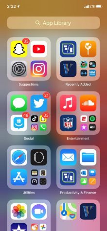
That is where the App Library comes in. The App Library is Apple’s way to organize your clutter for you. Swipe right and all the apps you have on your home screen and the apps hidden have been organized into categories for you in an easily searchable view.
The next couple features are between you and friends, well, not literally. You know how when you get a call and it takes over the entire function of the phone? Say goodbye to that. Now when your annoying friend calls you, his name will not take up the whole screen. There is a new banner that fades down from the top of your screen with the option to decline, answer or just ignore.
Also, using Facetime, if you want to go search the web for an inquiry or check twitter, the Facetime screen goes into what is called picture in picture. Here, the Facetime will be sent to one of the corners of your screen so you can communicate while gathering information. This is not limited to just Facetime. Most all in-app streaming applications will have this feature too. Watching Netflix and swipe up to go home puts the video playing, with audio included, on your home screen. This has never been seen before across the smartphone platform.

iOS 14 has changed almost everything stripped down to its foundation. In Messages, within groupchats, side conversations are possible with a press and hold on the person of choice. Siri is not a full screen anymore but rather a floating orb on the bottom of the screen. Weather now utilizes Dark Sky for super accurate precipitation predictions. Sleep tracking is now possible if you have an Apple Watch. AirPod Pros feature spatial audio to make it seem like you are in a movie theater with surround sound. The Music app has been redesigned with a personalized home page and color gradients blend behind the now playing screen. A translate app has been added, able to translate 10 different languages in speech.
Since the companies start up, they have always been there for those who customize. Since the first Mac, they have been selling to those who wanted more than a computer. The spirit is still alive and visible in iOS 14. The update is infinitely customizable from the widgets, down to what tone you like your audio.


