


College Basketball: The 10 ugliest courts

All across the country college basketball is played on the hardwood. In general, most courts have the same basic features and follow a pretty uniform design and mostly stay consistent with the same structure ,however, some teams infuse wacky and tacky designs on the court either with a plethora of colors or some sort of logo teams have tried to spice up their floors and stand out from the rest. From coast to coast some of these surfaces have become exotic and quite unsightly. Here is my list of the ten worst college basketball floors and arenas.
10.West Virginia
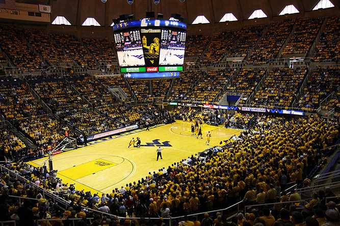
Location: WVU Coliseum
Capacity: 14,000
West Virginia gets number ten on the list for the ugliest courts in college basketball. If you have ever put a Mountaineers game on your TV and if you are anything like myself you can’t help but notice the amount of yellow on this court. The team will usually wear yellow jerseys on a predominantly yellow court making it hard on one’s eyes to differentiate between the players and the court. It is like camouflage and I think the Mountaineers need to either repaint the floor or adjust the lighting so viewers can clearly distinguish the players from the court. All in all it isn’t the worst of the worst and honestly it’s not really that bad at all, but when it comes down to it I think for the viewer West Virginia should adjust in some way.
9.Vanderbilt
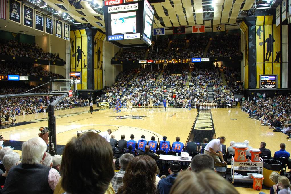
Location: Memorial Gymnasium
Capacity: 14,316
The Commodores court is fine as it is, but the problem with Vandy is the arena. If they are trying to compete with the entertainment in Nashville they need to adjust a few areas to make the place more fan friendly. As you can see from the picture the fans are not remotely close to the action on the court. It takes away from the experience of the game and the advantages that home crowds can provide when the closest fans are sitting about 10 yards away from the court. The crowd is an essential part to a college basketball and Vandy is clearly lacking “the Sixth Man”. Also, the teams benches are placed along the baseline instead of the traditional placement which is on the side of the court. This is what really baffles me I always thought that Vanderbilt was known for having really good academics and a smart student body, but the fact that they can’t even place the benches in the right spot is pretty strange. I think Vandy’s route to improvement would be first to fix the benches and then bring the crowd closer to the game,
8.Texas A&M
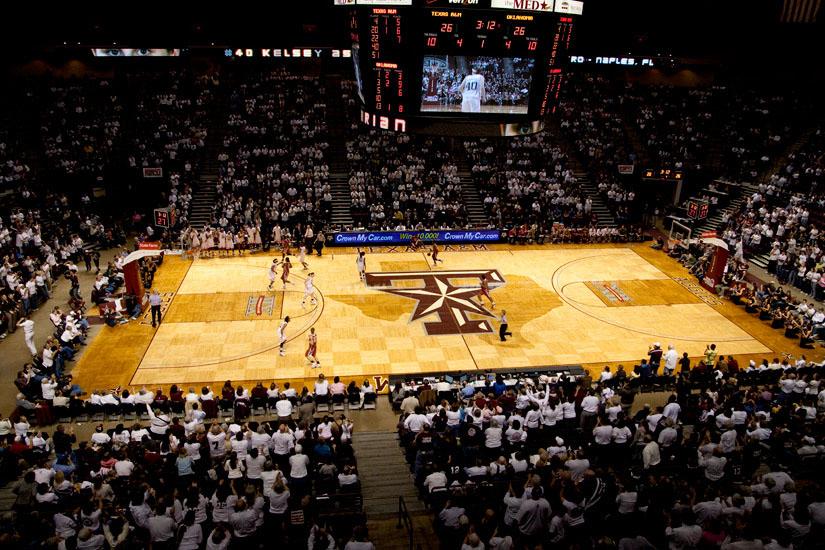
Location: Reed Arena
Capacity: 12,898
In the Lone Star State most sports fans only care about their football team ,however, that is not a valid excuse for the appearance of Texas A&M’s court. The Aggies Court looked pretty cool with the Texas state border around the Texas A&M logo, but then they decided to checkerboard throughout the entire court which I think pretty much ruined the hardwood. I get it that they are going for the Western/Texas/Cowboy feel, but the playing surface is not where they should try to get that message across. The court to me could use some maroon and grey and not so much of a wood like feel. If I could recommend any changes to the designers of Texas A&M’s court I think it would be better if they changed the color of the lane to maroon, made the area inside the arc grey, and got rid of the checkerboard.
7. NKU
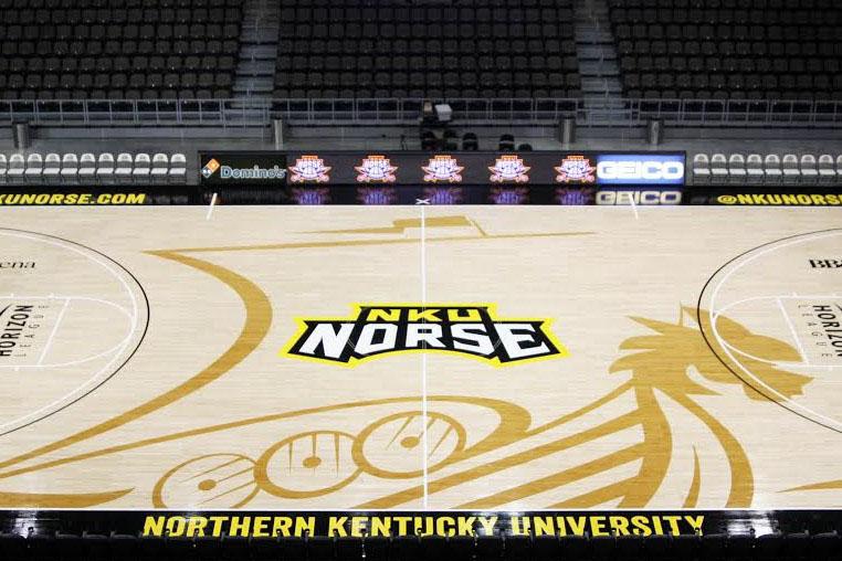
Location: BB&T Arena
Capacity: 10,000
I couldn’t tell you what a Norse is and I can’t say that the graphic on the court really helps me out. A trend among a few college basketball courts is to try and infuse a design or logo in the background their court like XU, George Washington, and many other teams. I absolutely hate it a basketball court is not a canvas and teams need to pick up on that. It looks like someone spilled water onto a dusty court and the “norse” or whatever that thing is was the puddle. I think that NKU should repaint the entire court and give it some color while getting rid of the design.
6.Colorado State
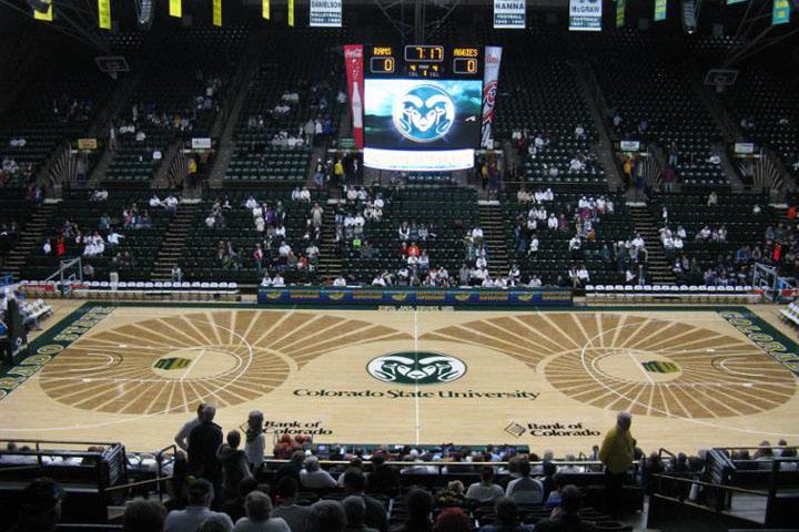
Location: Moby Arena
Capacity: 8,745
The Rams followed the same theme as NKU except they went way overboard on the ram horns. If I was playing a game at Colorado State every time I saw the horn I’d feel like I am being sucked into a tornado. I think they should’ve stayed true to classic basketball courts and not have tried to infuse a design into the court. They could make this court ten times better by just simply getting rid of those horns. That would go a long way.
5. FIU
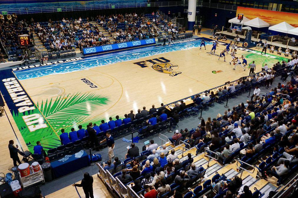
Location: FIU Arena
Capacity: 5,000
I absolutely love being on vacation in Florida; being in the sun, seeing the nice waves, and relaxing underneath the palm trees at the beach. However, I strongly think that a college basketball court should try to give me the same type of feeling. The court’s design graphics are very similar to NKU and CSU, but by adding colorful features FIU really makes it hard for opponents to focus in the middle of game. Although their court is hideous I will give the Panthers credit for providing a huge home court advantage. It’d take me at least the full length of the first half for my mind to realize that the blue painted wave is not actually the boundary. It also would give me the constant sensation that my feet were wet. As I said about the last two courts get rid of the graphics, or just place them somewhere other than the playing surface. If this were a painting of the beach then it would be great, but its a basketball court and it shouldn’t be treated like a canvas.
4.Northwestern
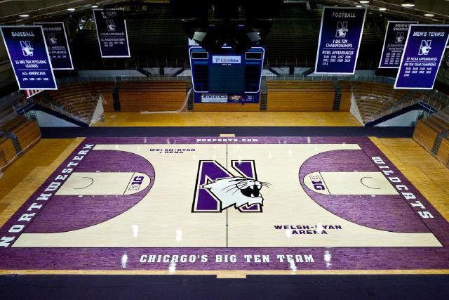
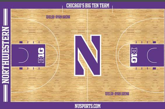
Location: Welsh-Ryan Arena
Capacity: 8,117
It may be hard to tell from this picture but Northwestern’s court has a light almost transparent shade of purple inside the arc and around the boundary of the court. My first thought when seeing this court was that the painters either ran out of paint or they only did one layer of paint. I think any unnatural see through color does not belong on a hardwood floor it will always look bad. Since, Northwestern announced that renovations will happen to the arena which will start in March of this year and end sometime in the fall of 2018. The court will look much better taking away the purple on the court except for the Northwestern logo at half court.
- Cal State Bakersfield
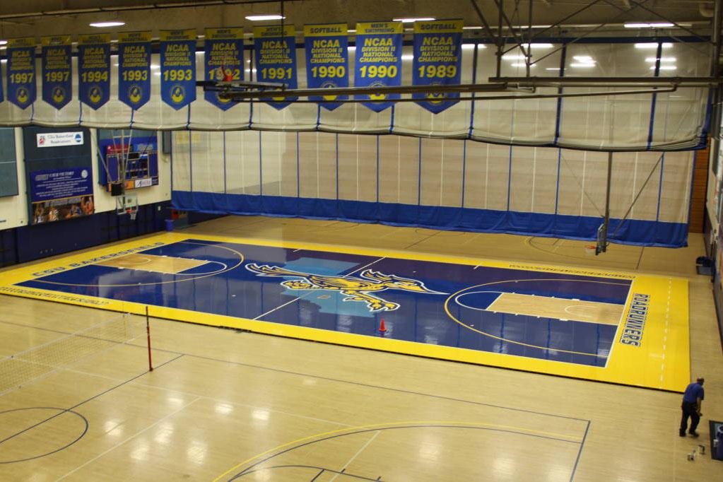
Location: Icardo Center
Capacity: 3,800
Cal State Bakersfield’s primarily blue court gets number three on the list solely because of the color. An all blue court with a light blue outline of the state of California behind the logo does not look good. In my opinion, it looks really slick and slippery almost like someone poured water all over the court. The Roadrunners can easily fix this pond looking court by painting the new court more of a wood grain color and by giving a more traditional basketball court feel.
2. UCF
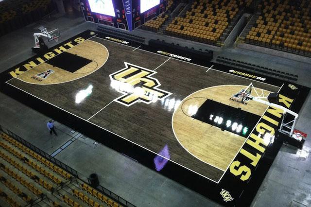
Location: CFE Arena
Capacity: 9,465
The Knight’s court is similar to Northwestern’s with the transparent paint, instead they went way overboard and painted nearly the entire court transparent black and gold. It is not a good look at all and unfortunately for UCF there isn’t really an easy way to fix this court. UCF’s light gold color would blend in with a traditional colored floor too much. My advice to them would be to put a secondary logo at half court and get rid of that awful looking black and gold paint.
1. Oregon
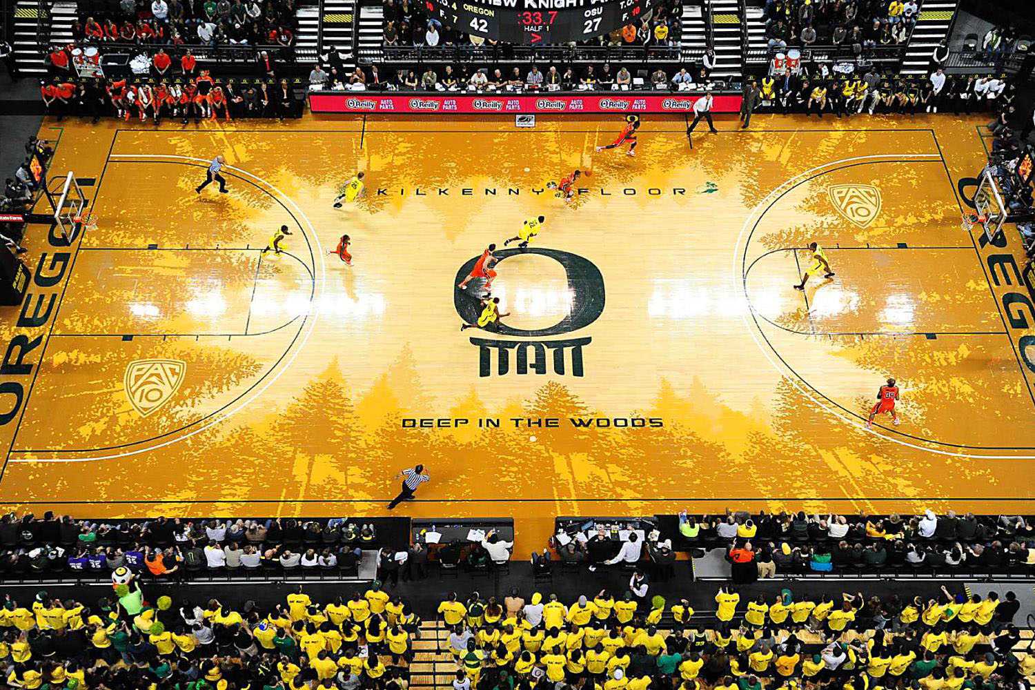
Location: Matthew Knight Arena
Capacity : 12,364
Last but least attractive on the list goes to the Oregon Ducks. Around Oregon’s court are a tan and yellow tree line referencing the states of Oregon’s nature and heavily wooded areas. That message doesn’t really get across the way they wanted it to and the final result turned out really bad. I feel like the designers of this court forgot that their mascot is the ducks. Animals who live in freshwater ponds not heavily wooded areas. It does not help when Oregon wears their highlighter green colored uniforms the two do not mix well; the court quite simply just does not match. I think it looks like there is a mold or fungus growing on the court and the only way Oregon can fix it is to just get rid of it all.


Leslie Carnell • Feb 27, 2021 at 3:15 pm
#2 should be TCU! That white is atrocious
peter schmitt • Jan 27, 2024 at 6:27 pm
absolutely the worst designed court in the WORLD.