

The “all whites” problem in MLS
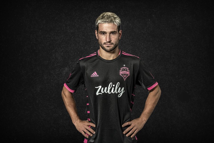
Nico Lodeiro models the sounders “Nightfall” kit, stepping away from the All White jersey problem in MLS
MLS is known around the world as a league for the oldtimers and retirees from the real soccer world. The league was formerly looked at as a joke. Old players, unconventional rules, Total American soccer is what it was.

Back in ’96, the only thing MLS had going for them were the sweet kits that were put out. Teams colors were not just yellow, navy, and white for the LA Galaxy or even just LAFC now with black and gold. BLAND COLORS. MLS used to be a fun league with fluorescent kits that radiated off the pitch in the sunlight.
As MLS starts their 26th season, I am looking back at the best kits in MLS in the past 26 years and the problem with the “All Whites.” These are boring plain white jerseys that all teams have as a secondary and a little touch of the Adidas cookie cutter templates.
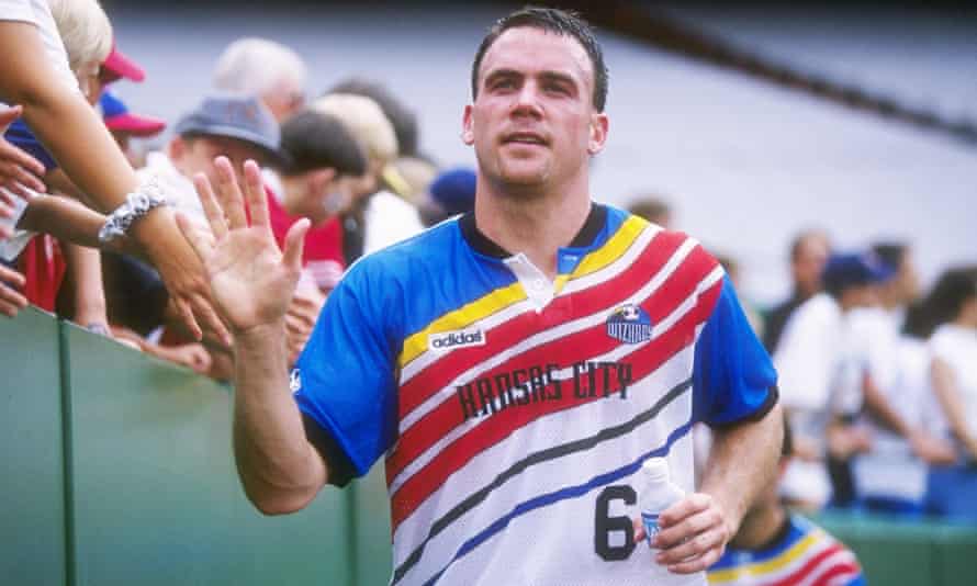
5. Kansas City Wizards Primary (1997)
Kansas City Wizards [now Sporting KC] had a very bold home kit in their second season in MLS in 1997. The primary kit was in an odd pattern of waves and stripes that were colored in blue, red, and yellow and it was just wacky and fun and really showed what MLS was about. (at the time)
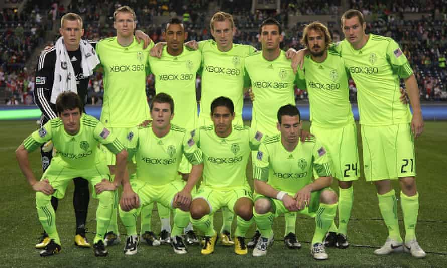
4. Seattle Sounders Third (2010)
A lot of fans would include one of last year’s all-white efforts, when MLS was struck by a league-wide pandemic of blandness, but the Seattle Sounders’ 2010 ‘electricity’ third kit takes the unwanted accolade as the worst kit in MLS history. Some may call this the worst kit ever in MLS but I call this art. The Sounders are a very “flamboyant” team so they can practically get away with anything at the end of the day and this kit just raditates color. Just look at all of that neon yellow.
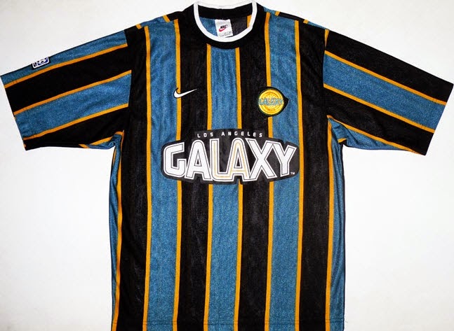
3. LA Galaxy Primary (1998-99)
The Galaxy really hit it out of the park with this kit. The teal base really pops with the yellow and it is funky to see on a soccer shirt and it also has nothing to do with LA the city as a whole. MLS teams now are trying to put more meaning into their kits so it has ties to the city which is cool but in reality, who cares? This kit is just wild and if one came on the market in a size large, I would buy it no questions asked.
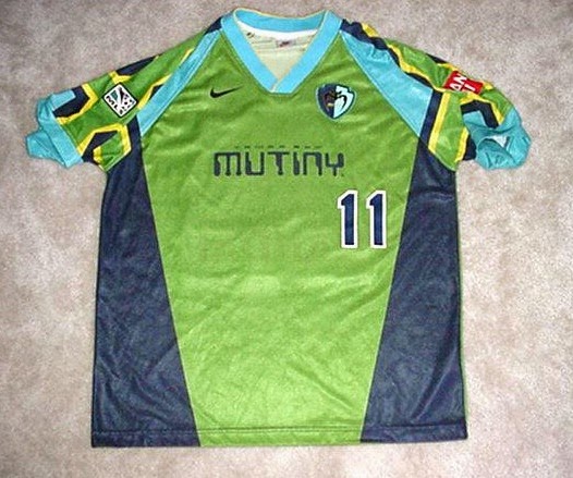
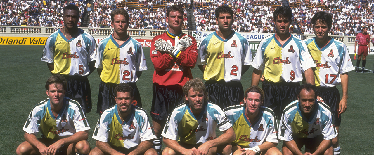
2. Tampa Bay Mutiny Primary [Rowdies (USL)] (1996)
The Tampa primary from 1996 is just so clean and so “out there” that I feel that it will never be done again. There is not much to say about this kit. It is just extremely vibrant and full of light greens and blues and also that logo…ridiculous.
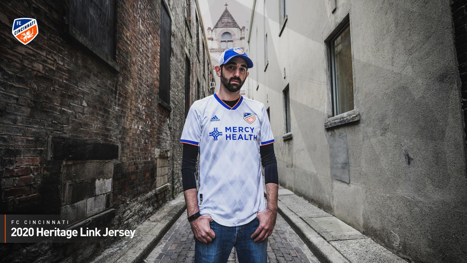
HM 1. FC Cincinnati Secondary “Heritage Link” (2020)
Cincinnati unbiasedly knocked this out of the park. The club tried to associate the German heritage with the club and how its Bavarian diamonds and orange and blue connects to the city. The detail of the kit really shows the effort in the jersey and how it wasn’t just a template. The diamonds are inlaid in the jersey and it looks clean as they are grey and the jersey is white with the orange and blue trim, too. Fire.
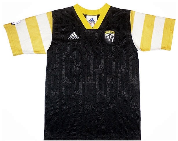
HM 2. Columbus Crew Primary (1997)
The crew primary looks stupid but it is a solid kit. There is not much to be said about it because it is just black and yellow and looks like a giant bumble bee jersey but it is cool and earns and HM for having the stripes on the sleeves. This gives me a football jersey vibe and it is a sharp kit for the late 90’s.
1. San Jose Clash [Earthquakes] Primary (1996-97)
San Jose murdered the game on this kit and really killed it. Yes, the kit is all white, but the blue tones and the yellow tones show modern day LA. (shown through current LA Galaxy kits) The weird Aztec style design is cool too, and it is a lighter colored kit and that’s why it wins my number one kit in MLS history. It really shows the wildness of the league and how much of a joke it was at one point. Also the team name, the CLASH. You don’t see European teams putting their mascots in their name like Arsenal FC or FC Barcelona. Awesome Kit.
Looking through these kits, they all have a solid amount of color and none of them look the same whatsoever, but as of late, MLS and their kit sponsor Adidas have been very diligent on keeping the secondary kits all white. Its literally a white Hanes T-Shirt and they slapped the club logo on the chest and the sponsor logo on the front.
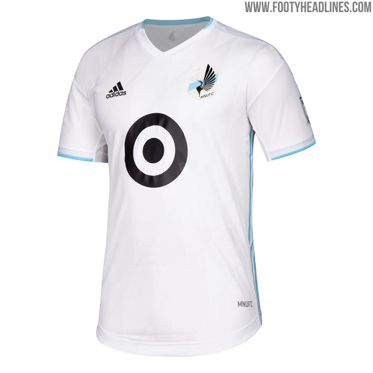
This really shows with the Minnesota United kit from last season. It’s literally just a T-Shirt.
My reason for this piece is to bring awareness to MLS, Adidas, the fans, and MLS Commissioner Don Garber to stop this from happening. It is taking the fun out of the game and actually makes me want to buy the kits less and less each passing year. Yes, they have done a decent job switching it up like with Seattle last season with the “Nightfall” kit and it was all black with pink trim but nobody was able to avoid the home kit template with the Adidas Three Stripes across the shoulders.
If MLS and Adidas can avoid this, I feel that there will bring even more of a draw to fans both young and old to see these kits be played in and then even purchased too.
Quill Vet, trying to go to college for journalism. @stoolpresidente is my dad. I love you, Dave. Panthers by 1000.
"You'd never believe how hard...


